


Bathrooms are small rooms, yet they influence how an entire home feels. Buyers remember them. Guests notice them. And homeowners interact with them every single day, usually in the first five minutes after waking up. Because the space is compact, even small design decisions become visually amplified. A tiny mismatch in tone, proportion, or material can make the entire room feel dated, cluttered, or unfinished.
Vanity countertops play the central role in that perception. They occupy eye level, reflect light, and visually connect sinks, cabinetry, mirrors, and walls. When they work, the bathroom looks intentional and elevated. When they don’t, even expensive fixtures cannot compensate. Granite Depot of Columbia often explains that most disappointing bathrooms are not caused by poor materials, but by incorrect decisions surrounding proportion, contrast, and placement.
Below are the most common mistakes homeowners make when choosing stone vanity surfaces and how to avoid them before installation day.
Choosing Stone Based Only on a Small Sample
The most frequent mistake begins long before installation: selecting a slab from a tiny sample piece. Natural stone never repeats itself perfectly. A four-inch square sample cannot represent movement, veining direction, or tonal variation across an entire vanity. What appears soft and subtle in a showroom chip can look dramatically active once spread across a 60-inch surface.
This mismatch causes visual imbalance. The backsplash might suddenly look busy, the mirror frame competes with the pattern, and faucets appear lost inside movement rather than anchored by it. Homeowners often think the problem is color, when the real issue is scale.
Viewing the full slab solves this immediately. The eye understands large movement differently than fragmented movement. Veins that feel chaotic in small pieces often become calm and architectural when seen across a full surface. Conversely, stones that seem simple in a chip can appear flat and lifeless once installed.
People researching bathroom countertops in Batesburg-Leesville, SC frequently realize that visiting a slab yard changes their decision completely. They stop choosing based on color names and start choosing based on visual flow. That single shift prevents a majority of design regrets.
Stone is not paint. You are not buying a shade — you are selecting a landscape.

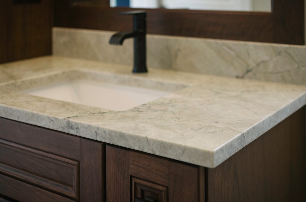
Ignoring Sink Proportion and Placement
Many bathrooms fail visually because the sink size and placement are decided after the countertop is chosen. This reverses the natural hierarchy of the design. The sink interacts with the stone every day through contrast, reflection, and shadow lines. When proportions are off, the countertop suddenly looks crowded or empty even if the material itself is beautiful.
A small undermount sink inside a large vanity leaves excessive exposed stone, making the counter feel heavy and the basin feel secondary. An oversized sink creates the opposite problem: the stone disappears, reducing the elegance homeowners expected from natural material.
Spacing matters just as much. The distance between sink edge and front edge affects usability and appearance simultaneously. Too narrow and water splashes onto cabinetry. Too deep and the user leans awkwardly forward, making the vanity feel uncomfortable.
Granite Depot of Columbia typically plans sink cutouts while the slab is still being selected. This allows veining direction to complement the basin rather than be interrupted by it. The sink should look carved into the stone, not punched through it.
When homeowners searching for bathroom countertops in Batesburg-Leesville, SC coordinate sink scale early, the final vanity looks custom even when the layout is simple. Proportion quietly communicates quality.
Creating Harsh Contrast Between Stone and Cabinetry
Contrast is powerful, but uncontrolled contrast is exhausting. Bathrooms often combine multiple reflective surfaces: mirrors, tile, fixtures, and lighting. Adding extreme countertop contrast on top of that overwhelms the eye.
A very dark stone over very light cabinets can work, but only when other elements soften the transition. Without balance, the vanity appears separated into two unrelated blocks. The brain reads this as visual tension rather than elegance.
Natural stone performs best when tonal relationships are layered rather than oppositional. Warm gray stone pairs with taupe cabinetry better than bright white. Cream-toned marble harmonizes with painted finishes instead of stark modern lacquers. Subtle connection makes the vanity feel integrated into the room instead of placed inside it.
Homeowners browsing bathroom countertops in Batesburg-Leesville, SC often discover they don’t need bold contrast to achieve interest. Movement within the stone provides complexity already. Supporting materials should frame, not compete.
The goal is not drama. The goal is cohesion that feels effortless.
Overlooking Edge Profiles and Thickness
Edge profile is one of the smallest details and one of the most influential. A heavy decorative edge can make a modern bathroom feel dated overnight. An ultra-thin edge in a traditional space looks unfinished. Thickness and profile together communicate style before color ever registers.
Bathrooms differ from kitchens because the viewer stands closer to the surface. The eye naturally notices shadows along the edge first. A simple eased edge produces a clean shadow line. A beveled edge introduces sparkle and brightness. A thicker mitered edge adds architectural presence.
The mistake happens when homeowners select edges separately from the room’s design language. The countertop may be beautiful but visually disconnected from cabinetry, mirror frames, and fixtures.
Granite Depot of Columbia helps clients align edge style with faucet geometry and drawer lines. Rounded fixtures work best with softened edges. Angular hardware benefits from sharper profiles. These micro-alignments create harmony the viewer senses without consciously noticing.
Those comparing bathroom countertops quickly learn that edge choice often determines whether a bathroom feels designer-planned or builder-standard.
Forgetting Lighting Interaction With Stone
Lighting transforms stone more dramatically than color selection itself. Bathrooms contain layered light sources: overhead lights, vanity lights, daylight, and reflections from mirrors. A countertop chosen under warehouse lighting may behave completely differently under warm indoor illumination.
Some stones glow softly in warm light but appear dull under cool LEDs. Others sparkle excessively under direct spotlights but become calm in diffused light. The mistake is assuming brightness equals beauty. In reality, glare reduces depth, while balanced lighting reveals texture.
Positioning of vanity lights matters too. Fixtures placed too low create sharp reflections across polished surfaces, flattening the stone visually. Slightly higher placement allows light to travel across the surface rather than bounce directly back into the eye.
People seeking bathroom countertops in Batesburg-Leesville, SC often bring cabinet samples but forget to consider their home’s lighting temperature. Matching the stone to the lighting environment ensures the bathroom feels warm in the morning and relaxing at night.
Stone is a reflective material, and reflection defines atmosphere.
Treating the Vanity as an Isolated Element
The final and most subtle mistake is designing the vanity independently from the room. Many homeowners treat it like furniture rather than architecture. They choose a countertop they love, install it, and later realize the room feels disjointed.
A vanity should connect visually to flooring, shower surfaces, and wall color. Not by matching, but by echoing tone or movement. A marble vein direction might mirror tile orientation. A granite speckle might complement flooring texture. These relationships create continuity.
Granite Depot of Columbia encourages clients to view the bathroom as a sequence rather than separate parts. When materials speak the same visual language, even small bathrooms feel larger because the eye travels smoothly through the space.
Homeowners who approach bathroom countertops in Batesburg-Leesville, SC this way rarely feel the need for frequent redesigns. The bathroom remains visually comfortable because it was planned as a complete environment from the start.
The most successful bathrooms are not defined by expensive fixtures or rare stone but by thoughtful coordination. Avoiding these mistakes turns natural stone from a surface into an experience.