


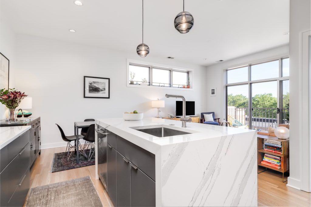
When homeowners begin looking at quartz, they usually start with color. White, gray, beige, dramatic black, soft cream. But color alone rarely defines how the kitchen will feel. What truly shapes the personality of quartz is the veining — the lines, movement, and depth woven through the surface. Veining determines whether the room feels calm or bold, modern or classic, subtle or expressive.
Quartz veining is engineered rather than geological, which means it is intentionally designed to mimic or reinterpret natural stone patterns. That controlled design creates consistency across slabs, but it also introduces important considerations. Unlike natural marble or granite, where variation is unpredictable, quartz veining can be symmetrical, directional, layered, or intentionally abstract. That predictability changes how it behaves visually once installed.
Granite Depot of Columbia often explains that veining affects scale perception. In small kitchens, large dramatic veins can visually expand the space by drawing the eye outward. In larger kitchens, soft delicate veining can prevent the room from feeling overly busy. Homeowners focusing only on brightness may overlook how movement interacts with cabinetry lines and lighting angles.
For clients exploring quartz countertops in Union, SC, veining often becomes the defining feature once they see full slabs instead of small samples. A subtle pattern that looked plain in a showroom chip suddenly reveals layered depth across a full island. Conversely, a bold sample may feel overwhelming once imagined across ten feet of surface. Understanding this scale relationship is the first step toward choosing quartz confidently.
Veining is not decoration. It is structure. It guides the eye across the room and sets the rhythm for everything around it.
How Does Vein Direction Influence the Layout of a Kitchen?
One of the most overlooked elements of quartz veining is direction. Veins rarely move randomly. Many engineered slabs feature directional lines that travel diagonally, horizontally, or vertically. Once installed, that direction interacts directly with cabinet edges, appliance lines, and island proportions.
If veins run diagonally across a long island, they can create a sense of motion. In some spaces, that motion feels dynamic and energetic. In others, it feels visually restless. Horizontal veining tends to emphasize width and openness. Vertical or downward movement can create height illusion, especially on waterfall edges.
Granite Depot of Columbia encourages homeowners to think about sightlines. When entering the kitchen, where does the eye land first? Does the vein direction support that focal point or compete with it? In open-concept homes, the island may be visible from multiple angles. Vein alignment across seams and edges becomes critical to maintaining harmony.
Homeowners choosing quartz countertops in Union, SC often discover that viewing slabs upright rather than flat changes their perception entirely. Standing the slab vertically reveals how the pattern will behave on a waterfall edge or backsplash. Vein continuity across corners and seams should be discussed before fabrication begins, especially when aiming for a seamless look.
Direction is subtle, but once installed, it becomes impossible to ignore. A well-aligned pattern feels architectural. A misaligned one feels accidental.
What Is the Difference Between Subtle and Dramatic Veining?
Quartz manufacturers create veining in varying intensities. Subtle veining resembles soft marble clouds, blending gently into the background. Dramatic veining introduces strong contrast lines that stand out clearly against the base color. Neither is superior. Each communicates a different mood.
Subtle veining creates calm. It works beautifully in kitchens where cabinetry or backsplash already carries texture or pattern. The countertop supports the design rather than leading it. This approach often ages gracefully because it does not depend on trend intensity.
Dramatic veining creates focal points. It draws immediate attention and can transform an otherwise simple kitchen into a statement space. However, it requires restraint elsewhere. Cabinets, hardware, and lighting should avoid competing lines. Too many strong patterns can overwhelm the room visually.
Granite Depot of Columbia frequently advises clients to imagine the countertop as either background or feature. Trying to make it both can lead to imbalance. For homeowners evaluating quartz countertops, the decision often becomes clearer when considering lifestyle. If the kitchen serves as a social gathering space, bold veining can create memorable impact. If it serves as a calm daily workspace, subtle movement may provide long-term comfort.
The key is consistency. A dramatic slab paired with minimal cabinetry can feel luxurious. The same slab paired with intricate cabinetry can feel chaotic. Veining intensity should complement the room’s design language.

Does Quartz Veining Look Artificial Compared to Natural Stone?
This question arises frequently. Because quartz is engineered, some homeowners worry the pattern might appear repetitive or overly uniform. The reality depends on quality and installation planning.
High-quality quartz designs incorporate variation within the veining to avoid obvious repetition. However, because slabs are produced in batches, pattern flow remains more predictable than natural stone. This can actually be an advantage. Vein matching across large islands or backsplashes becomes more controllable.
Granite Depot of Columbia helps homeowners examine multiple slabs from the same collection to understand repetition scale. When slabs are laid side by side, subtle differences often appear that are not visible in small samples. Planning seam placement and orientation ensures the pattern appears continuous rather than segmented.
Homeowners researching quartz countertops in Union, SC often discover that perceived artificiality comes not from the material itself but from improper installation. A poorly aligned seam exaggerates pattern breaks. A carefully aligned seam maintains visual flow. The craftsmanship behind the layout plays as much role as the slab design.
In many cases, quartz veining appears cleaner and more consistent under bright lighting than natural stone, which can sometimes reveal irregular mineral deposits. The engineered pattern offers balance between realism and control.
How Does Lighting Change the Appearance of Veining?
Lighting dramatically influences how veining reads. Under cool LED lighting, contrast becomes sharper, making dramatic veins stand out more. Under warm lighting, softer tones blend more smoothly, creating depth rather than contrast.
Natural daylight adds another dimension. Morning light may highlight fine veins that disappear under artificial light at night. Evening light can soften sharp contrasts, making bold patterns feel more relaxed. This dynamic behavior is one reason homeowners are often surprised by how their quartz looks different throughout the day.
Granite Depot of Columbia recommends evaluating slabs under lighting conditions similar to the home. A pattern that feels subtle in a warehouse may appear much stronger in a kitchen with abundant daylight. Conversely, a bold slab may soften beautifully under warm ambient lighting.
For those selecting quartz countertops, understanding light interaction prevents disappointment. Veining should be chosen not only for its appearance in isolation but for how it will behave within the specific lighting environment of the kitchen.
Light does not change the slab. It changes perception. And perception defines satisfaction.

Why Does Veining Affect Long-Term Design Satisfaction?
Trends often focus on bold movement, but long-term comfort depends on visual fatigue. Patterns that feel exciting initially may feel busy over years of daily exposure. Conversely, understated veining may grow more appreciated over time because it blends seamlessly into routine.
Granite Depot of Columbia often discusses lifestyle patterns with clients before finalizing quartz selection. Families who cook daily may prefer calmer surfaces that don’t visually compete with ingredients and utensils. Homeowners who entertain frequently might choose bold veining as a conversation starter.
The decision is not about trend alignment but about how the surface integrates into daily habits. When veining supports the space instead of dominating it, satisfaction increases with time rather than diminishing.
Homeowners choosing quartz countertops in Union, SC benefit from thinking beyond initial impact. The most successful kitchens are not necessarily the most dramatic but the most cohesive. Veining that aligns with cabinet color, flooring texture, and lighting tone will feel intentional long after current trends evolve.
Quartz veining is more than a pattern. It is the visual rhythm of the kitchen. When chosen thoughtfully, it transforms the space from simply updated to thoughtfully designed.